
By KHALIA WARD, JRN 111 STUDENT
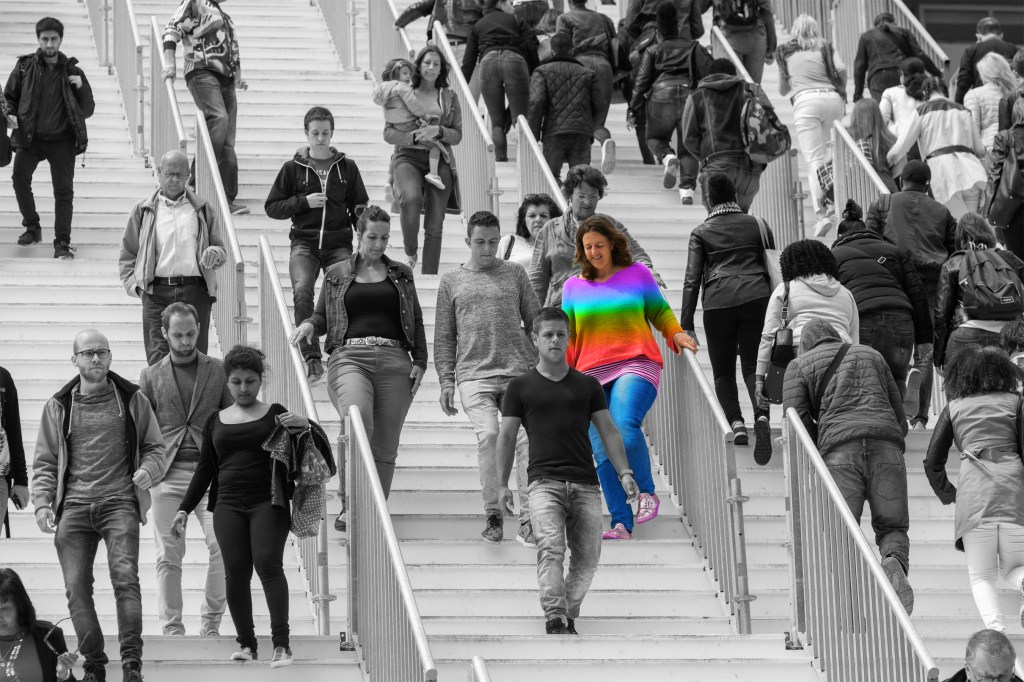
It began with a rebrand. In early March, PrettyLittleThing revealed its new look. Washed in beige, a model sits in a polyester knit dress, in a campaign stolen straight from Bottega Venetta. Bright colors, rhinestones and tiny skirts were abandoned for a sudden focus on minimalism.
As always, the internet had opinions. Once synonymous with hyper-femininity and unapologetically loud fast fashion, PLT’s pivot toward “quiet luxury” crumbled 20-somethings everywhere, with many accusing PLT of promoting conservative ideology. But the brand was simply following the culture. In a world obsessed with appearance, it’s hard not to notice something quietly vanishing from our lives: vibrancy.
From the rise of The Row’s monotonous cool to the photogenic wellness of Sporty & Rich and the neutral-toned empire of Skims, a clear shift is underway: Fashion is draining itself of color. This trend might not be just a matter of style, either.
It’s chromophobia, a deep-rooted cultural bias against color. And it carries more weight than you might realize.
David Batchelor, in his book Chromophobia, defines it not as a dislike of color, but as a fear–a coded one at that. Color is often painted as frivolous, vulgar or even sinful, particularly in Western history. It’s no accident that whiteness (literal and metaphorical) has long been associated with purity and control. The pristine white marble of modern homes, the sterile Apple store, the meteoric rise of TikTok’s “Clean Girl” all feed the mythos of “less is more.”
“We often think the lighter color something is, the cleaner it is. The darker color something is, the dirtier it is. And that not only plays into our fashion choices, our decorating choices, but also the epidemic of racism in our culture.”
Tyler Hewitt, professor of fine arts
“Women are expected to be pure when they get married. Men are expected to have played the field, right?” explains Tyler Hewitt, professor of fine arts at Moraine Valley.
“We often think the lighter color something is, the cleaner it is. The darker color something is, the dirtier it is. And that not only plays into our fashion choices, our decorating choices, but also the epidemic of racism in our culture.”
Today, bright colors are often coded as queer, feminine, ethnic, or immature. Men’s fashion remains rigid in its grayscale prison. Even joy is gendered.
“It’s wild how deeply we repress emotion in men—and with that, color,” Hewitt notes. “Women can express more. Therefore, they can be allowed to wear different colors. Men are supposed to keep their emotions reeled in. Part of that is reeled in color choices.” he explains.
In most cases when men get a break from neutrals, the two options are usually dark blues and red. Red is often entangled with intense emotions reserved for men, like lust and anger. Rich navy blues call back to security and authority with police officers brandishing navy blue uniforms. Anything else implies a forfeit of control and therefore of the trophy of masculinity.
Male students also notice this phenomenon. “I talk about this with a lot of my friends, and they all say when a guy goes to the store, he has this box that he has to fit in, versus when you go to a women’s store, there’s so many options to choose from,” commented Kavon Lanenga, 24, a digital art design major. “It’s crazy because I feel like there’s this uniformity now that everyone’s starting to almost look the same.”
His fears are not exactly unfounded. He opened up about not being able to wear his uncle‘s favorite color to his funeral for fear of being mistaken for a gang member in America.
“My mom told me—she’s like, no, I want you to wear all black, I don’t want you to wear black and red where we’re gonna be at,” he said. “And, you know, obviously there was a police presence. She didn’t want me to be confused with anything.”
Hewitt has his own chromophobia story. He recalls feeling the need to dye his once-neon green locks to a sensible brown in order to succeed in his current role.
“I had to go do an interview with the vice president of academic affairs, which is somebody who I never knew, and I thought okay, two things. One, I’m kind of tired of the green hair anyway. It’s hard to maintain colored hair like that,” he said, chuckling. “Two, I would really hate to lose this job because they looked at me with green hair and prejudged me and didn’t think I was going to be serious enough at the job.”
In the West, non-conformity is typically linked to the exotic unrefined “other.” We idealize our leaders in a big white house. Brides twirl in white gowns. Wall Street wolves barter in crisp white button-ups.
In the West, non-conformity is typically linked to the exotic unrefined “other.” We idealize our leaders in a big white house. Brides twirl in white gowns. Wall Street wolves barter in crisp white button-ups.
The shift toward minimalism isn’t new either. After the 2008 recession, we traded candy-colored iPods for brushed-aluminum MacBooks. Post-COVID, the “clean girl” aesthetic emerged. Her $500 beige leggings represented order in a time of global chaos. Now, in the era of class disparity and social media analysts, “neutral” is strategic.
Thin. Blonde. Quiet. A safe brand-able face for an even safer feed.
Meanwhile, in many non-Western cultures, Latin American, South Asian, and African alike, color is central to identity. To be colorful is to be seen, to assert that you matter. To be seen is not a disturbance.
“I don’t wear a lot of color, but I notice when I do, I get a more stares,” admits Batool Aljazarah, 18, a dental hygiene student in a sleek black hoodie. However, she said she feels at home expressing herself on campus thanks to the work of faculty and Moraine’s diverse student body. “There’s a lot of people who fight for us.”
And yet, color has always been a tool of resistance. In LGBTQ+ communities, color is pride, literally. In Black and Brown cultures, it’s a connection to ancestors. To dress in full color is not just a style choice, it’s a refusal to assimilate.
The irony to rebranding based on chromophobia? Color is actually what’s remembered. According to Kissmetrics, color increases brand recognition by 80 percent. But algorithms favor what society will tolerate, which means palatability over disruption. Cream beats chartreuse.
Maybe it’s time we ask ourselves: Why?
Who says that taupe is tasteful, but fuchsia is tacky? That a gray hoodie worth a car is aspirational, but a bright dashiki is “too much”?
In a society afraid of feeling too loudly, afraid of trying too hard, wearing neon yellow might just be the most radical act.


Leave a comment